
What do fashion trends, rent-seeking billionaires, and linear algebra have in common? There might be an answer. But I have to explain a few things first, and I need about ten to fifteen minutes of your time to do it.
The Art of Throwing Everything Away and Noticing Nothing
In systems science, physics, engineering, and dozens of other fields, a reduced-order model (ROM) takes a full-order model (FOM) of something (a high-resolution photograph, a model of the human body, a transportation network, a power grid) and maps it to a smaller, tractable version that can be simulated, observed, or studied on a modest computer. A few examples will make this concrete.
The Impish-Avoidant Cat
Say you want to send your parents a video of your cat slapping you. The clip is a minute long and the recording is in high resolution on your phone. You send it over WhatsApp or iMessage. Your internet provider knows exactly how much bandwidth you paid for, and because you bought the cheapest plan on the market, what arrives on your parents’ phone is noticeably worse than what you recorded. That original recording is a FOM of the world (i.e., the world here is the cat and its whiskers, the slap, all in high definition). What your parents receive is the ROM. They still see the only part that matters, and you still have your money. Basically a compromise that makes everyone happy.
Because it is virtually impossible to send the full-resolution files our phones produce, or to stream Christopher Nolan’s painfully long, uncompressed movies, ROMs are the compromise we live inside. Every streaming company (Hulu, Netflix, YouTube) has a department dedicated to building ROMs for videos and hence generating better compression quality and saving cash. ROMs let us be less wasteful without losing anything we would have wanted.
But what is actually being compressed? A picture, to a computer, is just a grid of numbers. One number per pixel telling it how bright and how red that dot should be. Stack those numbers up and you have a matrix, and we call it $X$. The figure below describes this where I took a tiny patch of a painting. The figure on the right shows how your computer views that patch.
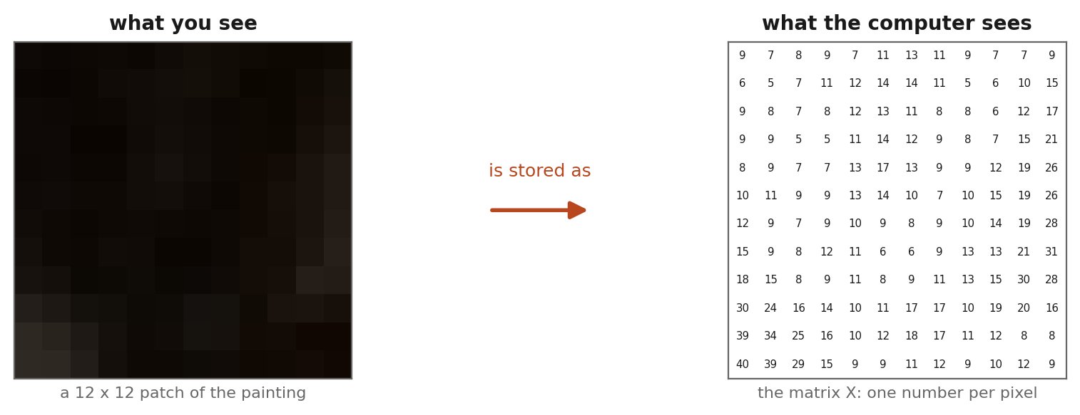
Figure 1. A picture is a matrix. Every pixel is a number, and a photograph from your phone is a grid of several million of them. A video is a few thousand of these grids per minute, which is why it is expensive to send.
So the problem becomes a question about matrices. If $X$ is the full picture, can we find something much cheaper that a viewer cannot tell apart from it? The algorithmic tool is the singular value decomposition (SVD), arguably the most important piece of mathematical machinery of the twentieth century. It rewrites any matrix as a stack of simple layers, ordered from most important to least:
$$ X = \sigma_1 u_1 v_1^T + \sigma_2 u_2 v_2^T + \cdots + \sigma_r u_r v_r^T, \quad \sigma_1 \ge \sigma_2 \ge \cdots \ge 0 \tag{1} $$
You do not need to read that equation closely or understand it. The only thing that matters is the shape of it. The picture is basically a sum of layers, the first layer carries the most information, and each one after it carries less. If you keep only the first $k$ layers you get an approximation of order $k$, and $k$ is a dial you can turn.
That dial is the bandwidth you paid for. I am making simplifications here but the general idea is as simple as that. Turning the dial down means fewer layers to transmit, a smaller file, and a cheaper internet plan. When you have limited roaming data overseas, you want to send pictures with a small $k$. When you’re on WiFi at a café, you want $k$ to be large. So turning $k$ up means a bigger file and a more faithful picture. Every streaming service on earth is quietly choosing a value of $k$ for you, several times a second, based on how good your connection is at that moment.
Figure 2 turns the dial on a painting I photographed in a museum in Amsterdam a couple weeks ago (what interested me in this picture is the observation that babies used to look ugly [maybe rather, they used to be portrayed to be uglier]…I took a lot of pictures and I can prove it). Anyway, the interesting thing is how long the scene survives. At $k = 40$ the image holds 97.3% of the original information while storing 8.9% of the numbers, and the faces are still faces. At $k = 10$ it is 92.5% of the information on 2.2% of the data, and these Europeans portrayed have become smears. The ugly baby is no longer there. Below that the picture stops being a picture. At $k = 1$ it is literally flat, bands of color with no detail at all, because a single layer is nothing more than one column pattern multiplied by one row pattern.
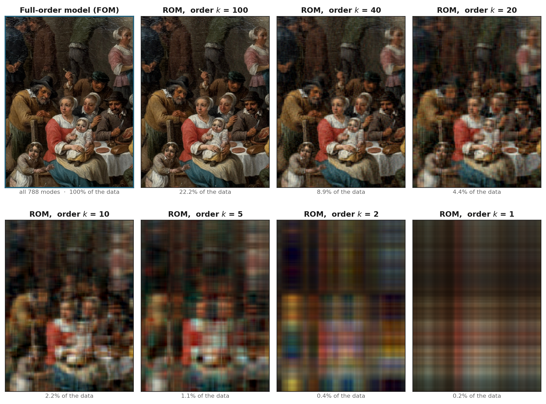
Figure 2. The same painting reconstructed from progressively fewer modes. Recognition survives far longer than you would expect, then collapses abruptly between k = 10 and k = 5. The final panel is the visual signature of order one (no detail anywhere, only a smooth product of one horizontal and one vertical pattern).
Compression works because the modes of a natural image decay fast, as shown in Figure 3. Most of the data we sample is redundant. (This might seem to contradict the point I am going to make, but please be patient.) A small number of patterns explain nearly everything, and the long tail of modes or order, the ones carrying the crack in the varnish, the individual brush strokes, the texture of the tablecloth, costs a great deal to store and contributes very little. Again, it is a tradeoff you have to make.
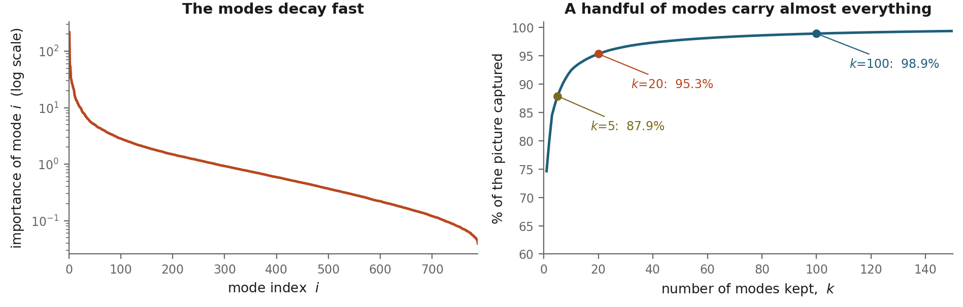
Figure 3. Left: the importance of each mode of the painting, on a logarithmic scale. Right: the fraction of the picture captured as modes are added. Five modes already carry 88%. This steep decay is the reason compression is possible; it is also, as we will see, the reason it is tempting.
Traffic Networks
Now consider the road network of Nashville: thousands of roads, intersections, traffic lights, and highway segments. Suppose the goal is to understand and predict how traffic conditions evolve after a crash blocks one lane. This matters, because it determines whether the city opens a shoulder or sends an officer to direct traffic. It must be decided in minutes, not hours, so fast computation and data processing are very important.
Writing down the FOM for a city that size is an enormous amount of bookkeeping. Drawing the network, assigning lanes per link, calibrating parameters, simulating demand under events and weather, is a lot of work that your junior engineer does not want to do because it is indeed boring and repetitive. And most of that effort is spent on intersections that will never matter. So let us shrink the problem to nine intersections and see what survives after compression or model reduction. This is an example that invokes dynamics (processes that evolve in time and space) compared to a silent painting at the Rijksmuseum in Figure 2.
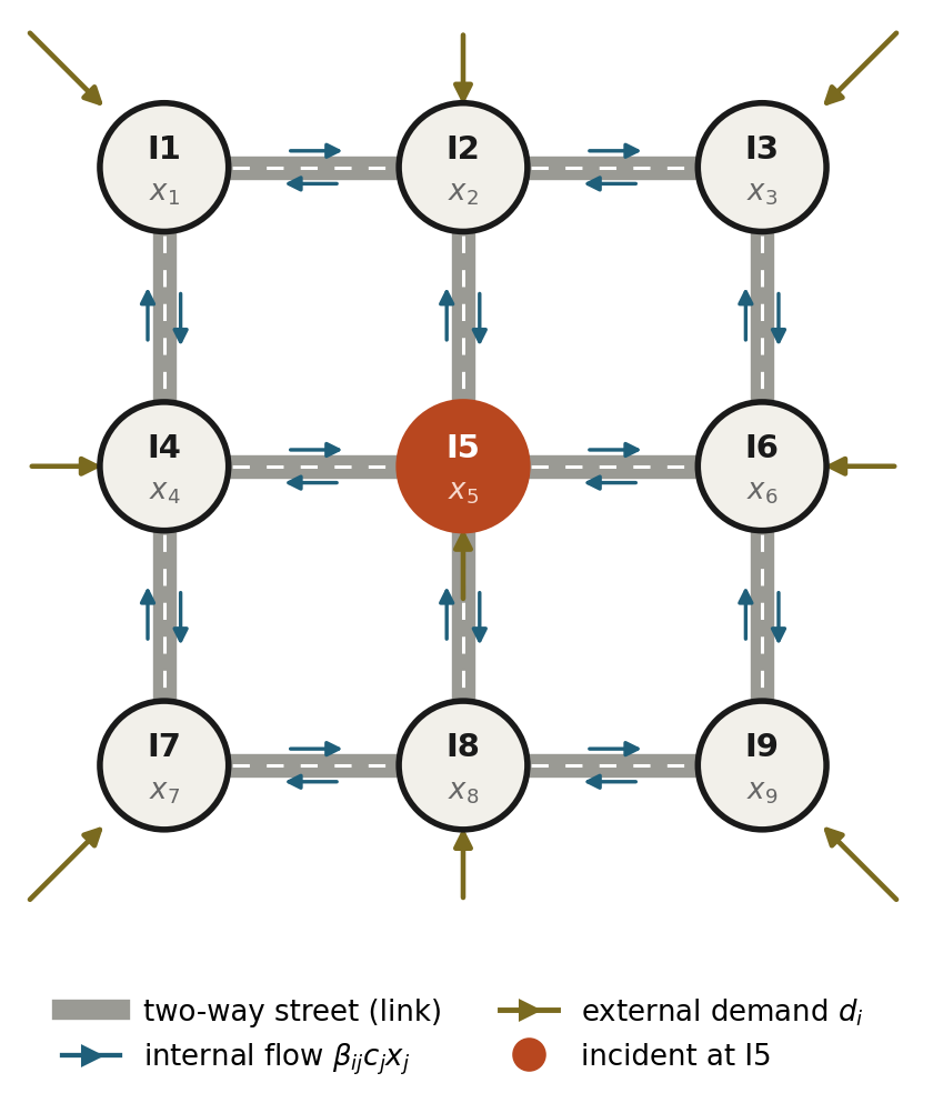
Figure 4. A nine-intersection toy city on a 3x3 grid. Each intersection i stores a queue $x_i$. Traffic enters from outside, moves between intersections along two-way links, and leaves the network at the boundary. The center intersection I5 is where we will stage an incident.
Let $x_i(t)$ be the number of vehicles queued at intersection $i$ at time $t$. This quantity is often called a state, because, well, it defines the state of the world you are studying. Over a short interval, vehicles are conserved. What is there now equals what was there, plus what arrived, minus what left:
$$ x_i(\text{now}) = x_i(\text{a moment ago}) + \text{what arrived} - \text{what left} \tag{2} $$
That is the whole model. Traffic models and engineers and mathematicians often complicate this model, but every traffic model is as simple as (2). What arrived is traffic entering from outside the network plus whatever the neighboring intersections sent this way. What left is whatever the signal at $i$ managed to discharge, which depends on how much green time that approach gets. Write one of these equations for each of the nine intersections, stack them together, and you have a system of nine coupled equations that predicts how the whole grid evolves. It would make a nice exercise to solve for a high-school student, although it is very tedious. Now imagine doing this exercise for an entire city.
We made some assumptions here. First, cars arrive from outside at a constant rate at every intersection, every signal runs its nominal green time, and the queues have settled to fixed values (about 36 vehicles at the center, 23 at the corners). Nothing is changing. That is the baseline in the first panel of Figure 5.
Now let’s break something. At $t = 10$ minutes, one approach into the center intersection I5 is blocked (an accident happened, or an influencer is taking a video), so intersection I5 can discharge only a quarter of the vehicles per minute it used to. Nothing else changes by assumption, as the demand from outside stays exactly constant, every other signal keeps its nominal timing, and the turning ratios are untouched. One number in the model drops, and it stays dropped for half an hour. Figure 5 shows what the equations modeling the real world do.
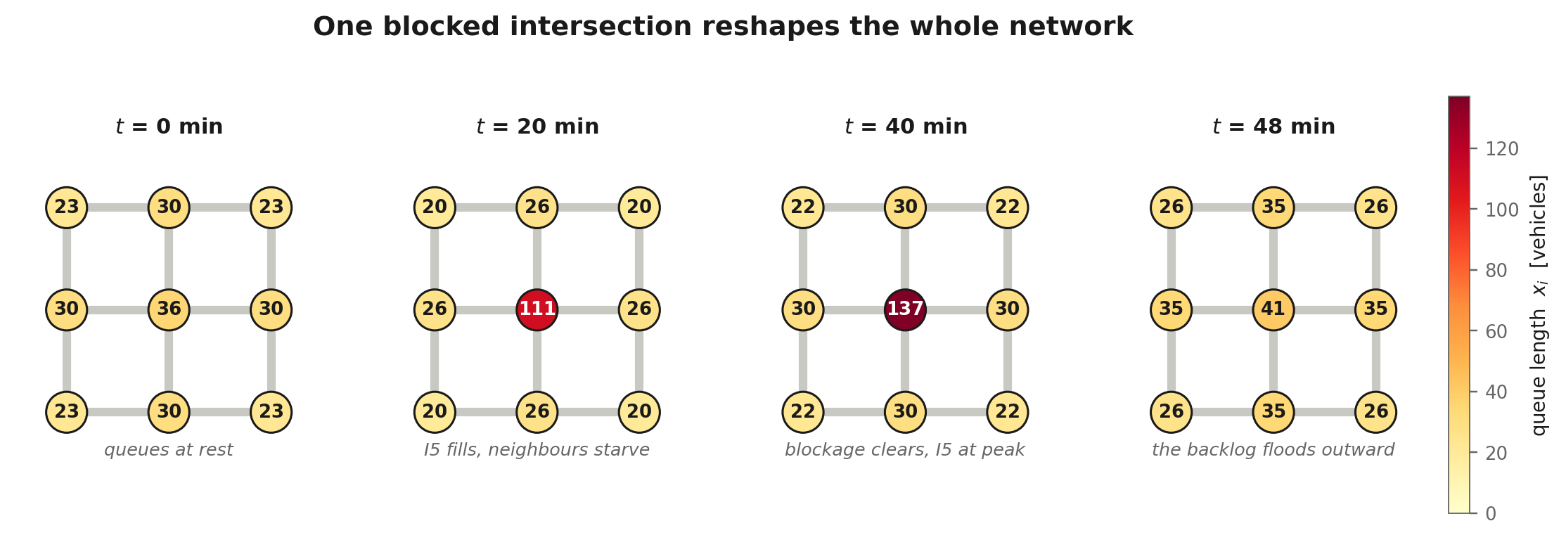
Figure 5. Four snapshots of the incident. Congestion does not radiate outward. The queue piles up at I5 (36 to 137 vehicles) while its neighbors actually empty out, from 30 down to 25, because the blockage is starving them of arrivals. When the incident clears, the accumulated backlog floods outward and the neighbors overshoot to 40 before everything settles.
The intuition that congestion spreads outward from an incident is wrong here. A blocked intersection is not only a source of queue, it is also a valve that has been shut. Downstream gets less traffic, not more, until the traffic valve opens, and then it gets all of it at once. This is beside the point of the article, but I wanted to tell you something about the occasionally interesting (but usually mundane) things in traffic behavior.
So let’s see how ROMs can be useful here. Nine traffic states is already a small number to model the network, but a real city has tens of thousands of states. So we do to the traffic model exactly what we did to the painting. Instead of tracking every intersection separately, we look at how the network moves during the incident and find the handful of patterns that describe almost all of that motion. Then we track those patterns rather than the intersections. The nine-dimensional problem becomes a two-dimensional one, and the mapping between them is a projection, the same idea as keeping the first k layers of a picture.
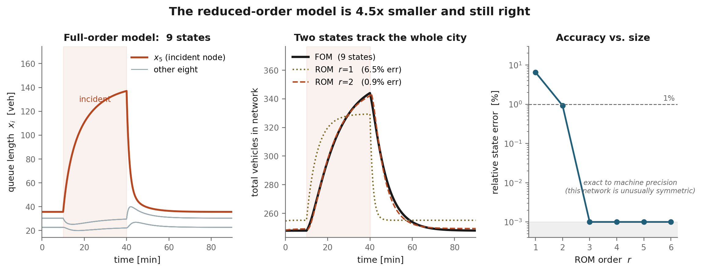
Figure 6. Left: all nine queues under the incident. Center: total vehicles in the network, full model versus reduced models of order 1 and 2. Right: accuracy against model size. One pattern gets the shape roughly right and the magnitude wrong, at 6.5% error. Two patterns reproduce the full nine-state simulation to within 0.93%, a model 4.5 times smaller that a traffic engineer could not distinguish from the real thing.
Run the reduced model on a laptop and you get an answer in seconds rather than hours, because it needs a fraction of the computation the full model does. The same trick extends far past static flow: to water quality and chlorine concentration in distribution networks, to voltage and current in power systems, to gas flow in pipelines. It works beyond built systems too, for river networks, watersheds, and climate models. It is genuinely remarkable that we can predict the behavior of an enormous, complicated system by shrinking it to something tiny and still say something true about it.
There is, of course, a trade-off. The bigger the ROM, the more faithful it is. But if it has to be nearly as large as the FOM to be trusted, the whole exercise was pointless. Every reduced-order model lives on that knife edge. Remember this, because the rest of this essay is about what happens when something other than an engineer decides where the edge is.
The World is Uncertain and Ignoring It Breaks the World
Now that we established this point, there is one act of deceit I performed that you might have overlooked. In the above case studies (the painting or the traffic network), everything was certain and clear. There were no sources of uncertainty, which is why a ROM with a low-order $k$ performs very well. How do the results change when we are unsure about the world? The next case study answers this question. Let us keep the same two-state model, built from the incident at I5, and ask it about a different afternoon: same city, same demand, same severity, but the blockage happens at I2 instead. Nothing else changes.
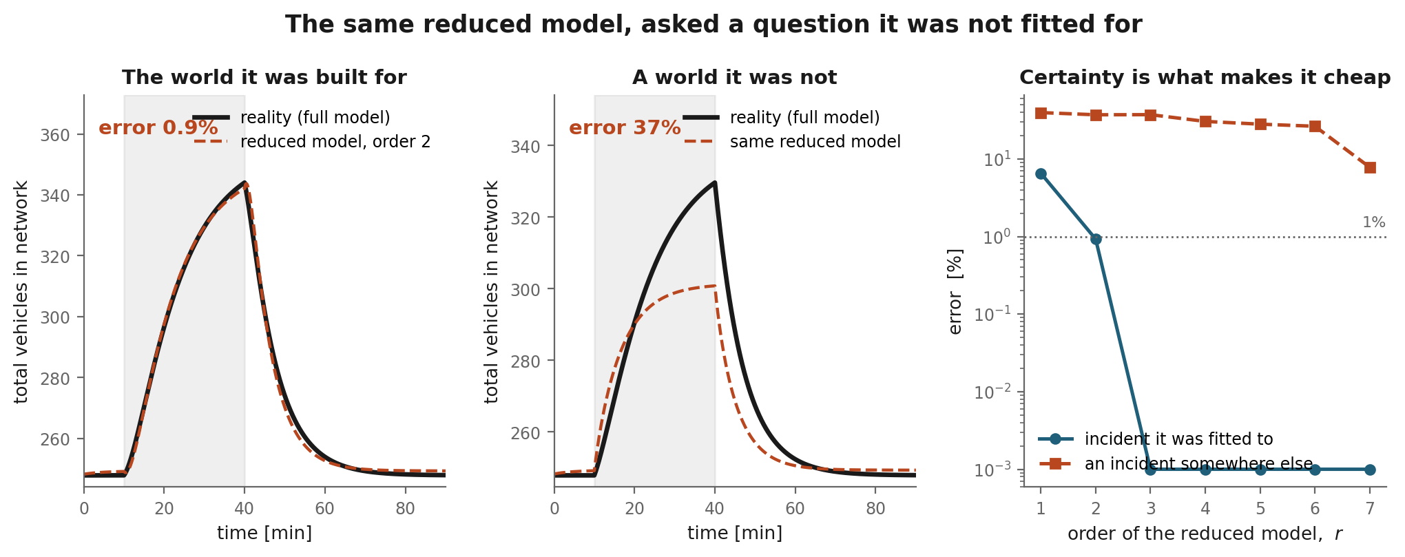
Figure 7. The same order-two model in two situations. Left: the incident it was built from, tracked to within 0.9%. Center: an identical incident one intersection away, and the model is wrong by 37%, underestimating the peak backlog by roughly thirty vehicles and clearing it too early. Right: error against model size. On the fitted scenario two modes are enough; on the unfitted one, even six modes are still wrong by 26%, and only the near-complete model recovers.
This is the part worth sitting with. The reduced model does not announce its failure. It produces a smooth, plausible, confident curve of exactly the kind an engineer would put in front of a city official, and it is wrong by a factor of forty compared to its performance the day before. Worse, the usual remedy fails too. Adding modes barely helps, because the modes we kept were the directions the network moved in during the incident we happened to observe, and this incident moves in directions we threw away. To be safe against an incident we did not anticipate, we need nearly the whole model back. The compression was never free. It was a loan taken out against the assumption that tomorrow resembles yesterday.
Hold on to this, because it is the hinge of everything that follows. I will come back to it at the end. The rest of this essay is about what happens when something other than an engineer decides where the edge is, and about who ends up paying when the world turns out to be uncertain.
The Main Point
Now that you have been patient with me, here is what I actually wanted to say.
The real world has become a reduced order of itself. The people have too. And the language models we have been milking are reduced-order models of the world, which is why every paper and presentation and talk now sounds the same. It is not difficult today to know, or to feel, whether something was written by a machine. Was this article written by one?
This should sound odd, given that I just spent two thousand words explaining why reduced-order models are wonderful. So let me be careful about the claim. I am not saying that the world becoming low-order is morally bad. I am saying that something is being spent quietly, and that we are not keeping the receipt. It’s like the federal spending on defense: the right and left both support increased military spending for more wars, but wanna scrutinize the peanuts that are given to scientific research. It’s laughable. Anyway, I digress. Let’s do some more examples on the new reduced-order world.
Buildings, and the Things Inside Them
Start with buildings. A nineteenth-century apartment block in Istanbul or Lisbon carries an enormous amount of information per square meter: moldings, tilework, window proportions that vary floor to floor, a facade that tells you which century it is from and roughly who paid for it. A new residential tower in a fast-growing city carries very little. It is glass, a curtain wall, and a repeating unit. You could describe the whole facade with a handful of parameters. It is low order. It is also somewhat funny because even though the architecture has become seemingly simpler, we still manage to turn it into a chore (you know that perfectly rectangular tower in Manhattan that’s so boring and ugly? Turns out it’s disintegrating and leaning. Even when we build ugly, the built environment decays). I took the next pictures in Milan and Dubai years ago; they show the clear contrast.
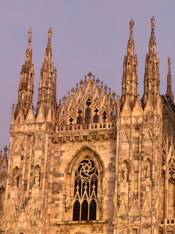

Figure 8. Left: the Duomo di Milano, begun in 1386 and finished across roughly six centuries. Right: the Burj Khalifa, Dubai, built in six years. Every spire on the left is different. Every floor on the right is the same floor.
I am well aware of the bias here, and survivorship bias is real. The beautiful buildings still standing in the Middle East and Europe are the ones that survived, and there is a silent graveyard of buildings that did not. But in this comparison I picked the Duomo of the twenty-first century, the Burj Khalifa, not a warehouse. And when I remember my late grandmother’s house, built in the early nineteenth century, it still had a higher-order set of modes than most buildings going up today. I will come back to this when I talk about efficiency and optimization.
Car Consoles: Not All Compression is Ugly
If the buildings example did not convince you, here is one that cuts the other way. Compare the dashboard of a 1990s car, a hundred and fifty physical buttons each doing exactly one thing, with the console of a Tesla Model 3, which is a screen and almost nothing else. This looks like the same flattening, and people complain about it in the same tone. But it is not the same thing at all. The Model 3 has more functions than the old car, not fewer. The two hundred buttons became one surface with thousands of states.
That is not order reduction. It is a change of basis as the linear algebra folks like to call it. The state dimension went up while the interface dimension went down. This is exactly what a well-designed output map is supposed to do. It compresses what you must look at without compressing what the system can do. And once you see it, you start seeing it everywhere. A great deal of what looks like flattening is complexity that has moved somewhere you cannot see it, into software, into supply chains, into recommendation engines, into things that we will never be told about because as the Arabic saying says “ما خفي كان أعظم” or The Hidden Is More Immense.
In short, the world did not necessarily get simpler. Some of it just went behind a screen.
This is a genuinely positive example of the reduced-order world we live in. The maximalists will complain.
But as I write this, I realize that the honest version of my complaint is narrower than the one I started with. It is not that everything is being reduced. It is that the visible layer, the part of the world we actually walk through, is being fitted to fewer and fewer modes, while the machinery underneath gets more complicated, not less. Perhaps the old world we had is now two worlds—the reduced order one we observe, and a higher order one we have no access to or understanding of. This in my review reduces robustness to what we do not need or want.
Coffeeshop Landscapes
Coffee shops are a purer case, because nothing is hidden behind a screen. And the pair below is not the pair I expected to end up with. The next figure shows two contrasting coffeeshops I have been to.
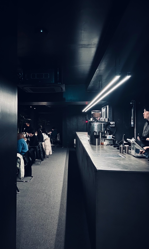
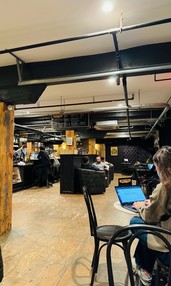
Figure 10. Left: a coffee bar in Tokyo. One counter, one line, one light, one direction to face. Right: a coffee shop in Nashville, Americano Coffee Lounge. Exposed beams at four different angles, mismatched chairs, hand-lettered signs, people sitting at every possible orientation, and zero consistency in the drinks they make. Sometimes I order a flat white and I get no foam and beautiful latte art, but other times I get a mess. I still like it. The Japanese minimalist coffeeshop, however, will produce the same cortado again and again. If you had told me in advance which city produced which photograph, I would have guessed backwards.
The Tokyo room is close to an order-one image. I would tell Claude to run the SVD analysis we did for the museum painting but I am sure the picture’s quality can be recovered with very small order. It has essentially one dominant direction, and everything in it is aligned to that direction, including the customers. It is beautiful, and it is also almost completely described by a single pattern. The Nashville room needs many more modes to describe: the ductwork, the columns, the chairs, and the people are all doing different things. It is messier and it carries more information.
The reason I like this pair is that it kills the lazy version of my own argument. This is not the East being flattened by the West, or the old being replaced by the new. The convergence is not geographic, it is a design language that is available everywhere at once, and any owner anywhere can now adopt it by looking at the same photographs of what photographs well.
Clothing and Fashion
Walk through any mall and look at the mannequins. The expensive brands have converged on monochrome, entire outfits assembled from one lethargic neutral (beige, gray, black, white, the occasional daring oatmeal). Every window is the same window. Nonchalance is the mainstream. Showing color is tacky. After a while you start to feel that the humans are mannequins and the mannequins might be humans, and neither group is having a good time. My niece in California dresses like my undergraduate students in Nashville who dress like the kids in Lebanon who also dress like the cool K-pop kids in Seoul. Rightwing zealots use parts of this argument to lament the disintegration of Western values (whatever that means), but my argument here is culture-agnostic; I am trying to relate linear algebra to this world. If you hide the facial and physical features of people, you will immediately realize we have become reduced-order versions. Convergence and conformity, even through a rebellious façade and thrifting on Saturdays, are the basis for this lower order world. The observed world is basically only a few eigenvalues, numbers that might not be real.
Language
The flattening extends past the visual and into the linguistic. My initial instinct when I started writing this essay was that we are using fewer words, that the language itself is shrinking, that words are going extinct. Then I asked for the data, and the data says I was wrong. The way in which I was wrong turns out to be more interesting than being right.
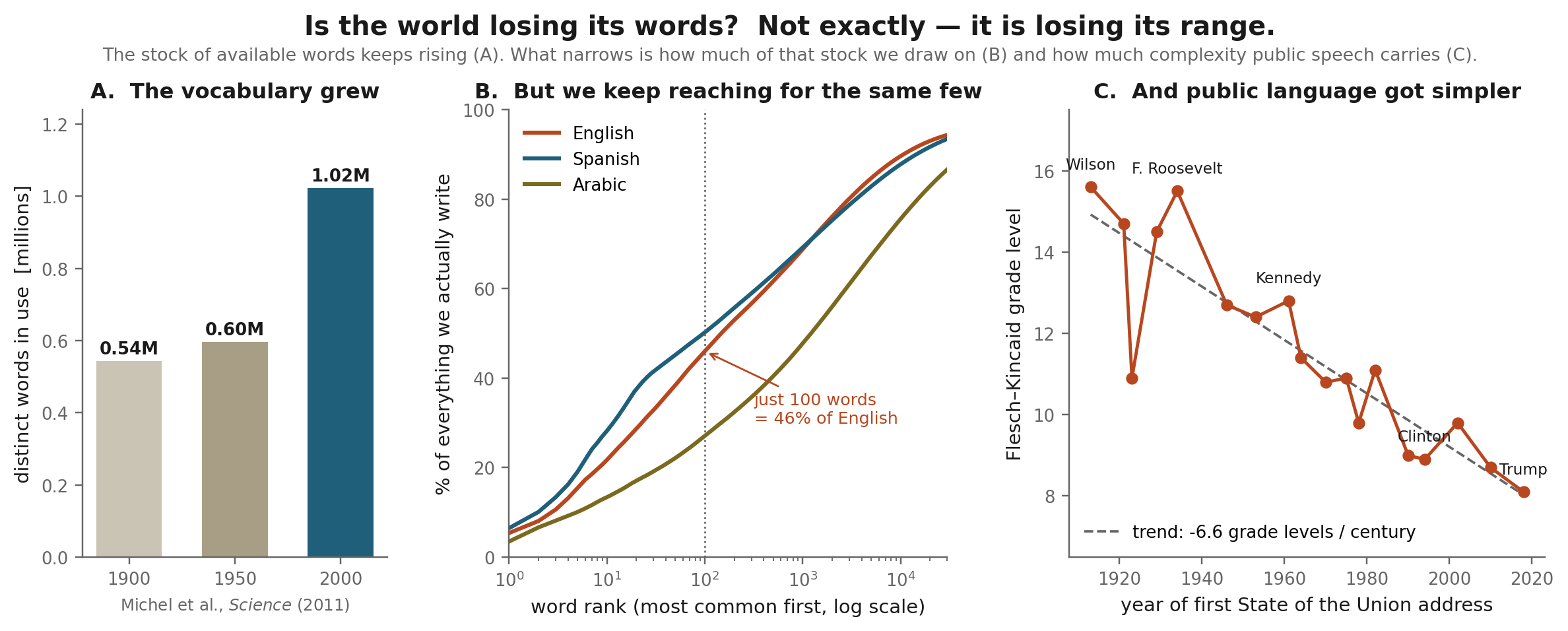
Figure 11. Three measurements. (A) The English lexicon roughly doubled during the twentieth century, adding on the order of 8,500 words a year. (B) Cumulative share of running text held by the most common words, computed from a large multilingual corpus: the top 100 words account for 46% of English, 50% of Spanish, and 27% of Arabic. (C) Flesch-Kincaid grade level of each president's first State of the Union address, 1913 to 2018.
Panel A is the correction. The English lexicon has been growing quickly, roughly 544,000 words in 1900, 597,000 in 1950, and over a million by 2000, an expansion of more than seventy percent in fifty years. Words do die, but far more are born. Anyone who tells you the language is shrinking, myself included, has not looked hard enough.
Panel B shows how concentrated our usage is. A hundred words carry nearly half of everything written in English. A thousand carry sixty-nine percent. The distribution is brutally skewed, and it is skewed in every language, though notice that Arabic is measurably less so, with its top hundred words covering only twenty-seven percent. This makes sense to me, since there are roughly ten million ways to say I love you in Arabic, and it is worth someone’s dissertation.
But that skew is not new, and it has not been getting worse. Written American English has actually become more lexically diverse since about 1900, measured on length-controlled samples of fiction, non-fiction, news, and magazines. So the flattening is not happening in the written record as a whole. It is happening in a specific place, and Panel C shows where. The Flesch-Kincaid grade level of the State of the Union address, a rough measure of how demanding a text is to read, has fallen from about 15.6 under Wilson to 8.1 in 2018, roughly six and a half grade levels per century. You do not need a fancy metric to tell you that Trump is an illiterate jerk. The same trend appears in the Congressional Record, which lost nearly a full grade level between 2005 and 2012 alone. And it is not confined to politics: an analysis of over 350,000 charting songs found that lyrics have become steadily simpler and more repetitive since 1970, with older songs showing measurably richer vocabularies.
This is the same structure as the car console. The total complexity went up. The broadcast layer, the language aimed at everyone at once, got flatter. Specialist writing has never been more varied; the words we say to the largest number of people have never been more uniform. What narrowed is not the language. It is the public register.
The cost is not vocabulary for its own sake. A public language with a working range of a thousand words cannot express the difference between disappointment and disillusionment, between grief and melancholy, between tired and depleted. When the shared range narrows, the distance between what a person feels and what they are able to say out loud grows. We are all transmitting through a lossy channel and calling it communication. I feel it personally, too. Because many words sound cringe today, I am tempted to say them less often, on a date for example. The robotification of our personal relationships is in full swing. I am not especially worried about it, but it is worth observing.
Why Is This Happening? Taleb’s Moral Objection to Efficiency
Nassim Taleb has spent several books making an argument I keep returning to: that policymakers and corporations design systems for efficiency, and in doing so quietly delete the redundancy that made those systems robust in the first place. Slack looks like waste on a spreadsheet that is engineered to maximize shareholder value. The second supplier, the unused capacity, the extra legroom, the frequent bathroom breaks, the spare part sitting in a warehouse for eleven years, all of it shows up as a cost and none of it shows up as a benefit until the day it is needed. So it gets optimized away (i.e., the optimal solution ensures it all gets discarded), and the system that remains is cheaper and faster, but one bad afternoon away from failing.
I want to make the aesthetic version of that argument, because I think it is the same argument. The ornament on the Duomo is redundancy. It does nothing structural. It is, in the strictest engineering sense, pure waste. And it ironically is also the entire reason anyone crosses a continent to look at it. I was there to support Inter.
So why has the world moved to reduced-order everything? A combination of things, none of them mysterious. First, variance is expensive to manufacture. A production line making one sweater in four neutrals is dramatically cheaper than one making forty designs, and the savings compound through every stage: design, tooling, inventory, returns, the photograph on the website. Uniformity is not an aesthetic preference that happened to win. It is the cheapest thing to build, and cheapness is a very patient force.
Second, time is the constraint nobody will accept anymore. The Duomo took roughly six centuries. Burj Khalifa took six years. No developer alive can raise money against a building that will not be finished within the lifetime of the loan, let alone the lifetime of the investor. The financing instrument selects the architecture before an architect has drawn anything, and it selects for whatever can be delivered fast and sold against comparable sales. Capital-intensive things cannot afford to be strange or too risky. Risk-aversion is a feature of the Anthropocene’s younger folks.
Third, we optimize what we can measure, or think we can observe. Once a cafe owner can see which interiors generate the most photographs, and a studio can see which openings retain the most viewers, and a writer can see which headlines get clicked, everyone begins climbing the same measurable hill. Nobody chose the monoculture. Each participant simply took the locally optimal step, and gradient ascent on a shared objective has exactly one destination. I hope the optimization nerds chuckle.
Fourth, the political ecosystem lets the second-order effects go unpriced. A firm that strips redundancy out of a supply chain captures the savings immediately and privately. The fragility it creates is paid for later, by everyone, usually during a crisis, and usually by a government. Data shows that the U.S. annual inflation rate stands at 3.4% for the 12 months ending in July 2026, but anyone with two brain cells can tell you it is way higher. The reduced-order America is pricey, and inflation is the quantified reduction in that order. When rent-seeking is cheap and the externalities are somebody else’s problem, optimizing to the bone is not a mistake. It sadly becomes the rational strategy, which is precisely what makes it hard to stop. It is why in my dreams I have a tiny shawarma shop designed to only break even. No optimization needed, and no shareholders to report to.
Then the feedback loop closes. Recommendation systems are trained on what people engaged with, and people engage with what they were recommended. This is a low-order projection of taste, deployed at planetary scale and updated hourly, and collaborative filtering is quite literally a matrix factorization. We built a reduced-order model of human preference and then let it decide what humans get to prefer. The social media feed is the order reduction’s most abrasive feature. And this feature is surely no bug.
Which brings me to the large language models. Therein, mode collapse is not a mystery either. A model trained to minimize expected loss is being explicitly rewarded for producing the conditional mean, and the preference-tuning stage on top narrows the output distribution further. What comes out is the centroid of everything ever written, which is why it is fluent and forgettable at the same time. No one reads an LLM-generated prompt and feels something. I certainly haven’t. Every paper sounds identical because everyone is sampling near the same mean, which in this analogy is like choosing an arguably small $k$ in an SVD.
The Uncomfortable Part
Everything so far has been, by and large, a complaint about texture. Here is the part that is not about taste at all, and it comes straight out of the mathematics in the first section. A reduced-order model is only valid near the operating point where it was built. I know I have made a career out of bashing linear systems and those who want to milk the linearity in the world to publish more papers, but the argument here is not personal.
The patterns we kept for the traffic network were extracted from one particular incident. Feed that model a disturbance unlike anything in the data it was fitted to, and it does not fail loudly. It fails quietly, and it stays confident while doing so, because the dynamics have moved into exactly the directions that were thrown away. Every practitioner has watched this happen. The discarded modes are not noise. They are the system’s reserve margins.
We already watched this happen. The traffic model in Figure 7 was not a thought experiment. A model that was right to within 0.9% became wrong by 37% when the blockage moved one intersection over, and it stayed wrong no matter how many modes we added back. Every practitioner has had a version of that afternoon. The discarded modes are not noise. They are the system’s reserve, and you find out what they were worth on the day you need them.
Beyond the metaphysical math and into the tangible, that is the real cost of a low-order world, and it has nothing to do with whether the Burj Khalifa is ugly. (It is ugly, although the sparkles are nice at night. It is even uglier when you realize that thousands of workers built it under awful working conditions.)
Redundancy is what absorbs shocks. Fewer modes means less redundancy, and less redundancy means the system cannot reject a disturbance it was not designed for. A monoculture is efficient right up until the disturbance it was not fitted for, and then it fails everywhere at once, because every element is the same element. The examples are not really metaphors, although they can be cliches. A single cultivar banana crop is efficient until one pathogen appears. A portfolio of assets that have quietly become correlated is diversified only on paper. A supply chain optimized to one supplier per component is the cheapest possible design and simultaneously the most brittle. In each case the variety that was discarded was not decoration. It was the error correction budget, and it had already been spent.
So: fashion trends, everyone dressing the same, linear algebra, and the world designed by rent-seeking billionaires. This is what they have in common. Reduction is not a decline in quality. The painting at $k = 40$ is a perfectly good painting. Reduction is a decline in the number of independent directions the world can move in; suddenly the world has fewer degrees of freedom. Reduction is good while conditions are nominal, around an operating point.
The world at order one still looks like something. It just cannot become anything it was never designed to be. In lieu of optimization and efficiency, bringing back the tacky and the redundant is how the world can be rich again.
Notes and References
Methods and Figure Generation
Claude Code was used to generate the simulations and some figures in this essay.
Figure 11: Language Data
- Panel A uses Jean-Baptiste Michel et al., “Quantitative Analysis of Culture Using Millions of Digitized Books”, Science 331 (2011), for the Google Books/culturomics estimate.
- Panel C uses Flesch-Kincaid grade levels of each president’s first State of the Union address from datascience@berkeley, with transcripts from the American Presidency Project.
Additional Language and Public-Register Sources
- C. Pilgrim, “The rising entropy of English in the attention economy”, for the finding that written American English has become more lexically diverse since 1900 using word entropy.
- Sunlight Foundation analysis of the Congressional Record.
- Emilia Parada-Cabaleiro et al., “Song lyrics have become simpler and more repetitive over the last five decades”, Scientific Reports 14 (2024).
Taleb and Fragility
- Nassim Nicholas Taleb, The Black Swan: The Impact of the Highly Improbable, Random House (2007; second edition, 2010).
- Nassim Nicholas Taleb, Antifragile: Things That Gain from Disorder, Random House (2012).